
FIORE PIZZA
FIORE PIZZA
FIORE PIZZA


Overview
1-800-Contacts was looking to expand their online vision exam with other partners like CVS and the New York DMV, but we needed to create a white label solution for them.
The Problem
1-800-Contacts works with multiple partners. One of those partners is CVS. With businesses and doctors offices being closed, they were very interested in having an online vision exam. The only thing was they didn't want any 1-800-Contacts branding or any CVS branding on it. They needed it to be a white label service that felt like a third party platform. With that in mind, I started designing some concepts while the development team started the backend work to make this possible.
Typography
The first thing I wanted to tackle is typography. I needed to find a typeface that didn't feel too branded one way or the other. I also needed the font pairings to be flexible enough to be used on Headlines, Body Text, and UI elements like forms and buttons. I used a screen that had all these element and laid out a bunch of options. After we looked at a lot of fonts, we narrowed it down to 3-4 options that would work.

Layout
Then, I started looking at layout options. I started by looking at some key sections in the exam. I designed a couple of variations to see how each layout was working. I included both Mobile and Desktop to ensure we were creating a solution that worked across all platforms.


Wireframes


Color
As I was designing different layouts, I also explored different color options. I needed to pick very neutral color schemes for most the UI elements. For the button color, I wanted to add something that provided a lot of contrast so the user could always see where to click.
Like typography, there was a lot of exploration that went into this process. One thing we really wanted to ensure was that all colors were passing accessibility standards. This gave me a great opportunity to learn more about accessibility and build my skills in this area.
Micro Interactions
I also took the time to look at some different interactions within the exam to improve those and bring more life to the interface. First I took a look at different menu interactions.
Then I took a look at different ways we could improve our countdown timer. For the exam to work, we need to have people walk back 10 feet from their device and read letters. The countdown gives them the time to do that before advancing.
I also looked at ways to enhancing our search functionality when users were searching for their contacts.
Design System
Once we had looked at all the different options, we decided on a solution that would meet all our business goals and provide the best user experience. We combined a couple ideas from each solution and they really produced a strong result. With the layout decided on, I start to establish a Design System so we could apply this to all our different partners.
Bringing a more systems approach would improve consistency and cohesion to the designs. I also knew it would make the Development process go a lot faster.
Typescale
The first thing in the Design System I wanted to establish were the font styles. I started with the body text then used major thirds to define the other styles. I did some rounding to make sure things worked out nice and evenly.

.png)
.png)
Color
After getting the colors finalized through the early design exploration work, we narrowed in our a color palate that would work for the product.
.png)
Components
After we had color, grids and spacing established, we went on the building out the different UI components like buttons, form fields, dropdowns, etc. Once this was established, designing the rest of flow went a lot faster.

With a clearly defined Design System, the frontend work went pretty fast. This was accomplished with lots of documentation to create a shared language of how things were working.
New York DMV
Shortly after the project for CVS was finished, the New York DMV approached us about designing a vision test to help people renew their Driver License online. With DMV offices being closed at the time, it made it really difficult to renew your license. They wanted to see a quick prototype of what it would look like.
Wireframes
Before getting too far with the designs, I met with our Product Manager to see what screens we would need for this. Since we weren't renewing a contact lens prescription, the process was a little bit different.

High Fidelity
After understanding the flow, I used the Design System elements to quickly design a mobile prototype. I met with some key stakeholders in the project to get feedback before presenting it to the New York DMV.
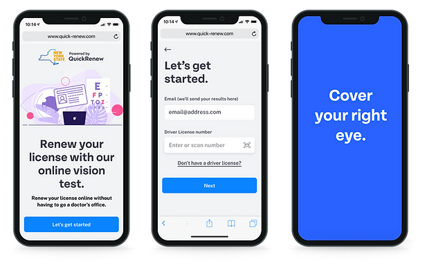
Here is the prototype we made for the DMV to get their buy in and discuss the different elements of the exam that we would be including in V1.