
FIORE PIZZA
FIORE PIZZA
FIORE PIZZA


Overview
The lack of a unified homepage led to fragmented user journeys and inefficiencies in managing spending and completing transactions. Users needed seamless navigation to relevant actions and clear, actionable insights
Problems to solve
-
User Experience Issues: The app lacks a unified flow, making it hard for users to navigate and complete tasks.
-
Transaction Declines: Many transactions fail due to low card balances. We need to improve visibility of available funds.
-
Confusion Over Budget and Tasks: Users are unclear about switching budgets, requesting more funds, and what tasks they need to complete when they open the app.
What does success look like?
Before designing anything, the Product Manager and I aligned on our vision of success and established core design principles for the new experience.
Business outcomes
-
Increase total payment volume
-
Decrease percentage of transactions declined due to insufficient funds
-
Help people spend faster
-
Increase the percentage of users who activate a virtual card in their mobile wallet within 7 days of onboarding
-
Increase fund request adoption
Customer outcomes
-
Accelerate Month-End Reconciliation
“Help me close the books faster” -
Increase percentage of transactions that are “completed” in less than 24 hours
-
Decrease percentage of transactions that occur in wrong budget
Design principles
Here are the core design principles that guided us to make decisions faster:
Design principle #1:
Action oriented
Help people complete their tasks by keeping them focused with subtle, unobtrusive graphics, standard controls, and predictable behaviors.
Design principle #2:
Radical transparency
Give users a clear understanding of their finances to increase trust and incentivize more spend occurring on our platform.
Design sprint
Next we kicked off a design sprint. Our goal was to have a prototype we could test with our customers by the end of the week.
We started white boarding together and sketching some solutions out. After that, I moved on to more high fidelity designs that I kept on refining until we felt good about what we wanted to test.


Other considerations
A couple of iterations we tried was what should we show at the top of the screen. We debated between showing your card vs. a task list. We also looked at different ways to display quick action buttons.


Aesthetically speaking, we thought having the card felt right. It anchored things and brought a more delightful experience when opening your app.
Another reason we went with having the card at top was the outcome we wanted to improve was card declines. Having a quick see if you can spend became our guiding principle.
User testing
Overall, the testing of the new homepage went really well. We made a couple of small changes based on feedback from our testing sessions, but lots of our hypothesis were validated as this was the right direction to go in.
Building
After testing, we meet together, reviewed things, talked feasibility, made some tradeoffs for our first MVP, then they started building things pretty quickly.
Due to the fact that the homepage touched most areas of the product, it was pretty incredible how fast the team was able to complete this. In about a month we pretty much had redesigned the whole entire app.


Updates and changes
Before the new homepage was released, customers would see a list of cards when the opened the app. It helped people get a sense of all their cards, but it did give a lot of guidance.


To make it more action oriented, we started by putting your card at the top of the page and making it more obvious to request funds.
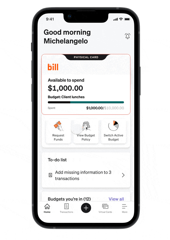
We also made it easier to see all the budgets you belonged to and switch the budget you were spending out of.
We also called out what you could actually spend on and see your spend policy.

We also added a to do list to the app so you could easily complete the things you need to complete so you could close your books faster.
A new quick action button to better call out the most common actions to help reduce time in app.
We also added different screen views based on your role so it was more contextual to what you needed to do for your job. Budget owners needed to send people funds and admins needed to monitor their credit line and make sure everything looked good.


Better onboarding
To help achieve our outcomes of reducing declines and getting people spending faster, we knew we needed a better onboarding experience that would guide people into using the product successfully.


Results
-
Percentage of users creating virtual cards within the first 28 days increased from 58.6% to 68.8%
-
Percentage of users ordering physical cards within the first 28 days increased from 73.0% to 92.5%
-
Activated physical card within the first 28 days increased from 49.5% to 68.8%
-
Spend within the first 28 days increased from 66.7% to 73.1%
-
Reduced declines due to card insufficient funds from 58.5% to 43.2%

Conclusion
The redesign resulted in positive feedback from customers and meaningful business impact. We successfully reduced transaction declines, which not only increased revenue but also alleviated customer frustrations from declined payments.
We also created a more cohesive home screen, leading to overwhelmingly positive feedback about the app's ease of navigation and use. As a result, we observed an overall improvement in our NPS score, which was encouraging since major redesigns can aren't always met with excitement.
New homepage was released in Oct 2023

Other achievements
In addition to redesigning the mobile home screen, I contributed to several company initiatives aimed at creating a consistent experience across our three separate products.
Following BILL's acquisition of two companies, it was essential to establish uniformity throughout our products. The first step in unifying our apps under one brand. This included retiring our old logo and updating color and fonts. I worked with closely with a few of our developers to make the necessary updates.
I then worked with all our product teams to make sure things looked on brand and nothing was broken. We collected screenshots and put them in FigJam to call out what needed to be changed.

Mobile strategy
After unifying what our apps looked like, we needed a strategy of how all our experiences come together. To accomplish this, a group of around 20 team members—including designers, PMs, and development managers—gathered for a week-long onsite in San Jose. During this time, we collaboratively developed a comprehensive three-year strategy to integrate our user experiences across our three products into a single app.


We then worked with our teams to execute on the three years strategy. I started creating a mobile design resource center for the designers to learn the new design system, native iOS and Android patterns, and our mobile strategy. I also hosted office hours sessions to help answer questions and get up to speed.
We had a launch party for our first release. This time we meet in our Draper office.

