
FIORE PIZZA
FIORE PIZZA
FIORE PIZZA


Role and duration
Product Design
Timeline
Nov. 2019 - July 2020
Website
Overview
1-800-Contacts had asked a digital experience design agency to do some UI explorations of what ExpressExam, their online vision exam could look like. We had new styles we were changing to and wanted to created a design system for the product.
Goals
The main goals of the redesign were to...
1- Create a more mobile-friendly experience.
This would help us as an e-commerce company because that's where a lot of traffic was. But we also wanted to differentiate ourselves from our competitors by offering a solution that didn't require two devices.
2-Increase the number of completed exams by providing a seamless experience.
We knew if we own the platform, we could increase exam approvals with our doctors and get people ordering a lot quicker.
3- Improve perception of online exams
Online vision exams were a new concept to most people and there were some tricky steps you needed to take. For instance, you had to take pictures of your eyes, then walk back ten feet from your device and read some letters out loud. We needed to add more guidance to help meet our goal of more completed exams.
4- Create a more friendly and personal exam that people could trust.
Beyond capturing exams, we wanted to make healthcare more affordable, and online vision exams were the first step in accomplishing this. If we could create a powerful solution, this would change the industry.
Before we got too far in the process, we talked about the story we wanted to tell with our product and established a conceptual model to tell that story.
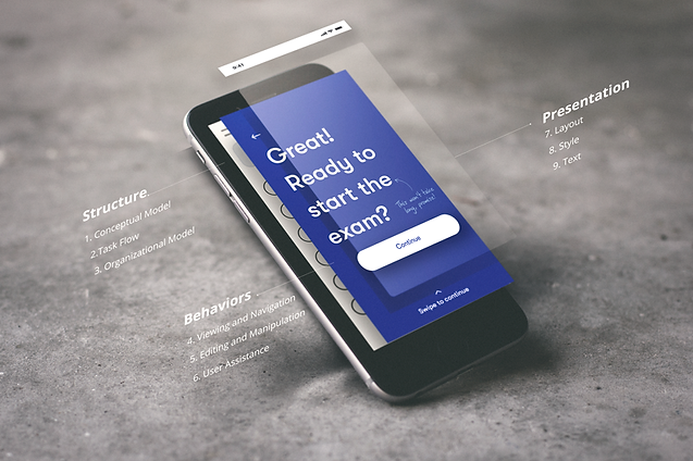
Conceptual model
We wanted to create the experience of going to see your doctor vs taking an exam online. We also wanted to create something that built trust and credibility while also being friendly and conversational. We used that as a framework for the goals of the project. We also talked to them about research insights and usability improvements we had made to improve the product.
After we talked about the structure, then the agency started exploring wireframes and more polished designs. This process was very iterative. We meet quite frequently to provide feedback on the designs at each stage of the process.

We would review designs and give feedback along the way.
The Handoff
After the designs were delivered, our team would be the ones who built the product. We met as a team and made a plan on how to break up the work. I took the final visual styles and worked with our dev team to build a design system for our product.

Grids and breakpoints
We needed a good foundation in play before we started laying the groundwork. We started by defining breakpoints and grids.

Typography
Typography was how we would be talking to our customers. We used larger-type styles to create better guidance and be kinder to the eyes. Our audience was people who needed to get their vision renewed so we wanted to take that into account when we were talking to our customers. As a team, we documented the styles and the naming conventions together so we could all be speaking the same language.
Working closely to break up the work.

Color
We took the existing brand colors and made them more vibrant to create that more warming personality.

Inputs and Controls
Next, we looked at how our customers would be talking to us. The idea behind this new style was to simplify what we were using and add more space to improve usability. These felt more open and friendlier to use.
.png)
.png)

.png)
Illustrations and Icons
To create a friendly and warm personality in the experience, we used custom illustrations, icons, and hand-written notes for our customers.


Next, we looked at how our customers would be talking to us. The idea behind this new style was to simplify what we were using and add more space to improve usability. These felt more open and friendlier to use.

Layouts
After building our design system atoms, we looked at our layouts. First, we looked at mobile. We wanted the user to be able to navigate the exam better using one hand. The agency came up with a layout to meet that outcome.

On the left is our old design and on the right is the new design. As you can see our previous design was built for smaller phones. The inputs are higher on the screen.

We also looked at establishing patterns on mobile. A solid screen would introduce a new step so you feel progress as you took the exam. We would use these other screens when we needed the user to do something.

For Desktop, to create better conversations the agency established a pattern of conversation by having us talk to the customer on the left and the user talking back on the right.

Close
collaboration
Working closely with developers really helped me think more systematic in my approach. Keeping naming conventions the same was important to created a shared language first we started with the code.

And because we were being loose and scrappy, we used confluence to document styles so developers had a single source of truth.

Then it came all together to look like this

What I learned
-
Establishing a conceptual model is powerful in telling your product's story
-
Working collaboratively brought designs and developers together speaking the same language
-
We moved fast and were scrappy, but we didn't cut quality. We were proud of what we built together.
-
Establishing these patterns early on helped us to move quickly and looked at future improvements. More on how we did that in the next case study.