
FIORE PIZZA
FIORE PIZZA
FIORE PIZZA

Overview
ExpressExam had recently gone through some pretty significant design changes to make it feel more modern and easier to use. You can read more about it here. The older designs were out of date and not very mobile friendly. As we rolled out this new look and feel, we began to see some of our product health metrics begin to dip so we started to find out why.
What is the problem?
During a significant rebrand when we updated both the visual styles and navigational flows, we saw a significant impact to our core metrics that let us know we were successful. The core metrics we were monitoring were:
1- Time to complete the exam
2- Number of exams completed
3- Number of exams that resulted in customers buying contact lenses through our e-commerce platform.
The problem was we had mad so many changes all at once that it was difficult to see what was causing the issues. We had a lot of quantitative telling what pages were being effected the most, but we didn't understand why. To understand this, we started doing usability testing with a focus on the pages and flows we knew had issues quantitatively.
How will we know if we solved the problem?
Seeing improvements to three metrics listed above would be a key indicator of success. Also seeing drop-off rates improve on each page was a key indicator that we were headed in the right direction. Those were the measurements, we just needed to understand what was going on to make improvements.
Homepage
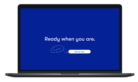
Let's start with the homepage. To take an online vision exam, you had to go to 1-800-Contacts homepage then click on the ExpressExam section. Here's what it looked like:

During the usability test, we asked users where they would go to renew their prescription from the homepage. We found a lot of people we're having a hard time locating it. Even thought the text said "Renew your prescription right here, right now."
Two theories we had were
1- There was some banner blindness going on.
A lot of the imagery felt like ads and people were breezing right past them. The text is also hard to read on an image.
2- The white button doesn't provide enough contrast.
The button color wasn't prominent enough to be noticed. Because of the background image, it was kind of just fading into the background.
We ran some quick A/B test to validate if some of the assumptions were right. Sure enough changing the image and providing better contrast fixed the issue and we started to see the numbers of exams completed go up. Here's what we changed it to.

Landing page
In order to get a prescription, customers have to take pictures of their eyes and walk back ten feet. When we were looking at drop off rates, we noticed these two sections were big. We had just heard about a customer who couldn't take the exam because when he started the exam, he was on a ski lift. Once he got to the ten feet part he was out of luck. We had always seen some online reviews that brought up they also felt unprepared for the exam.
So had two theories we thought could fix that was.
1- We should doing a better educating what to do when they got to those pages.
2- The landing page wasn't offering clear instructions on the things you needed to do to take the exam. This is what the landing page looked liked before:


We quickly came up with different concepts to better prepare people for the exam. I first started with wireframes to see how I could tell the story better with different imagery and layouts.

After exploring lots of concepts we made some changes to set expectations of front of what you would need to take the exam.


After we released our new landing page, we did an A/B Test and monitored the results. What we found was overall exam completion rate go up. We saw a little dip on the conversion of this page, but that was ok for us because we knew we were setting up a better user experience by setting the right expectations. If someone didn't have 10 feet of space they weren't starting the exam then getting half through then bailing because they couldn't complete the exam.
In person testing
One of the biggest learning was testing the exam with person in person. We got to see how people were interacting with their device and noticed some big things to change.
One big one we noticed is when we were asking people to reading letters from 10 feet away. We had thought that asking people to flip their phone into landscape mode would make the phone easier to place on a table then walk away. What we found is a lot of people's phones were locked and couldn't move on to complete the next step.
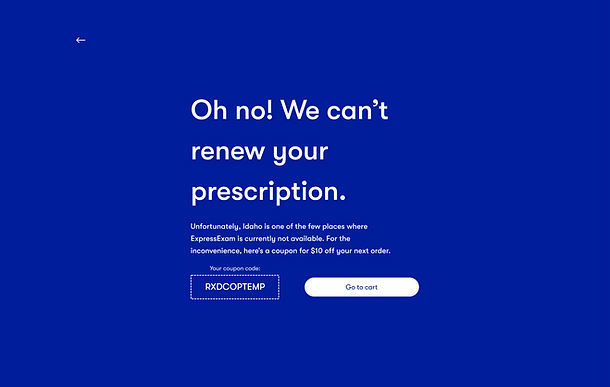
Disqualification
Telehealth isn't for everyone and there are certain things that could disqualify you from taking the exam. Some of things were age, eye health, and the state you lived in. Some states don't allow tele-health services and would need laws passed in order for this to change.
A theory that the business wanted to test was if we could move these qualifications to the end of the exam instead of having them at the beginning. This came about because an executive was telling someone about this cool technology of online vision exams. The person was disqualified at the beginning and couldn't take the test. The thought was we could get more buzz and word of mouth of people could actually take the exam before being disqualified.
The theory didn't hold up. Customers were so mad that if they had contacts in their cart before taking the exam, they left before completing the purchase. Or sometimes customers would purchase for other people in their household after the exam. They ended up not doing this at all if they were disqualified.
So we put disqualification up front, and also gave them a coupon if they couldn't complete the exam. This offered a great opportunity for us to express empathy for the situation.
After making these changes, we started to see contact orders go up.
By using qualitative and quantitative data together, we were able to make some significant improvements to all are three key performance indicators. . We saw a decrease in time to complete the exam, an increase in the number of completed exams, and improvement to contact orders after starting the exam.
Key takeaways
Our biggest take away from the whole project was that big redesigns are hard monitor if you make a lot of changes all at once. We had done a lot of UI updates as well as flow changes. This made it extremely hard what needed help in the new experience.
If we could have gone back and did it again, we would have tested all our flow changes in the old brand. That way we could get a better idea of those changes were hurting the experience. Once we validated which things were helpful vs which ones were hurtful, then we should have done our grand reveal redesign. Or vice versa, but the two things at once caused a lot of confusion on how to fix the experience.